 dubskool.
Core identity / lightSource PNG
Good voices. Clear direction.
The work is expressive. The system stays calm. Familiar type, generous space and a few unmistakably Dubskool details.
Make every word sound right.
01 / Identity
The existing Dubskool mark and sculpted Raise Your Voice lettering carry the personality. Give them room. Keep the geometry intact.
dubskool.
The website header uses the mark alone at 28–32 px wide. The shared footer combines mark and wordmark, one handwritten direction line and email above four quiet link groups. The artist hero and footer use the ink Raise Your Voice SVG; the black strip uses the white variant. The favicon is black on opaque white.
The original logo PNG is white artwork on transparency. Render it black on paper, white on ink. Do not replace the master file with a recoloured export or treat the typed footer wordmark as a new logo asset.
Standalone applications: leave at least ¼ of the mark’s height on each side. The box is a construction guide, never a badge.
02 / Colour
Start with paper, ink and quiet neutrals. A composition should work before colour is added. Give every colour a defined job. Purple belongs to illustration and interaction; lime marks a phrase, decision or key fact.
--paper / #FAFBF7The canvas. Space to think.--ink / #1D201AWords, actions, contrast.The original logo detail, selected states, focus and compact audio controls. Keep body copy and ordinary surfaces neutral. Purple is the lead expressive accent, not a page-wide wash.
One short headline phrase or an important fact. The campaign’s 20-hour band is a deliberate exception to the quiet canvas. Keep normal actions ink; do not turn every card or button lime.
#EFEFE8Quiet groups and audio cards. Prefer open space to another box.
#686C62Secondary copy. Never reduce legibility just to make a page quieter.
#DCE0D5Structure and dividers. Not the only boundary of a form field.
#8A8E84Visible field boundaries on paper or white.
#7653B9Lead expressive accent: original logo detail, focus, selected states and compact audio controls. Existing approved headline highlights may retain it.
#58782DShort handwritten editorial accents. Do not pair it with another decorative colour in the same block.
#E8E4F2Reserved supporting token. Current calculator invitations use paper and ink; do not add lavender panels to new compositions.
#A12B27Only an actionable error, with words and field association. Not decoration.
| Pair | Contrast | Application |
|---|---|---|
| Muted / Paper | 5.17:1 | Supporting text |
| Purple / Paper | 5.45:1 | Focus and accent text |
| Purple / Lime | 4.80:1 | Existing headline treatment |
| Green / Paper | 4.88:1 | Handwritten accents |
| Control border / White | 3.34:1 | Field boundary |
Calculated sRGB contrast. Do not use small lime text on paper. Check new combinations; colour never carries meaning alone.
| Colour | Use it for | Leave it out of |
|---|---|---|
| Paper / ink / neutral | The canvas, reading copy, normal actions, forms and cards. Aim for at least 85% neutral UI outside the artwork. | Do not alternate pastel sections to create variety. |
| Purple | Spot ink in illustrations; focus, active steps, selected controls and compact audio play. | Long body copy, page-wide washes or every card background. |
| Lime | One meaningful phrase per section; a key commitment band or a deliberate action on ink. Usually no more than 10–15% of the UI area in a viewport, excluding art. | Ordinary field labels, decorative stickers or a grid of competing primary buttons. |
| Campaign wordmark | Original ink/purple artwork on a small paper tab at the portrait’s top-left. | Simulated wax, embossing, recolouring or an extra decorative palette. |
| Status colours | Errors and recovery, with text and an icon where useful. | Meaning by colour alone; red as a decorative accent. |
These proportions are composition guides, not a pixel quota. Approved purple/lime artwork can contain both inks. Keep their UI roles distinct.
03 / Typography
Three familiar voices, each with a job. Scale, weight and space create hierarchy; colour does not have to.
Every word.
Well heard.
Balanced lines. Tight, readable spacing. Green marker underlays sit behind all heading glyphs, with reserved line spacing; never pull a highlight into the line above. The existing footer wordmark uses 800.
Tell us the story, the audience and the deadline.
From the first script to the final files, keep the next step clear.
Readable body copy, plain instructions and consistent controls. No handwriting in navigation or form labels.
A human touch. In small doses.
One short supporting line, with an upright Manrope heading. Never faux-bold or faux-italic. Green is the established editorial accent; the founder letter is a deliberate long-form exception.
| Role | Size | Rhythm |
|---|---|---|
| Client hero | 38–70 px | 1.1–1.2, balanced |
| Page / section | 34–44 / 28–38 px | 1.15–1.3 |
| Card heading | 18–24 px | 1.3 |
| Body / lead | 16 / 18–21 px | 1.7–1.8, pretty wrapping |
| Controls / meta | 14 / 12–14 px | Legibility before density |
| Editable fields | 16 px minimum | No phone focus zoom |
हर शब्द साफ़। हर आवाज़ अपनी।
Use readable script fallback and natural tracking for Hindi and other scripts. Transcripts use automatic direction. Dynamic counts and dates use tabular numerals.
04 / Actions & icons
Ink is the default action colour. Keep one primary action in each decision area, with a quieter secondary route.
Live component examples / links open website pages
Busy and unavailable are visual states here. No request is running. Explain a disabled action’s reason in the actual workflow.
One 24 × 24 grid, 1.7 px rounded strokes, no fill, currentColor. Use the original northeast arrow path, not a text arrow or emoji. Give icon-only controls a name; decorative icons stay hidden from screen readers.
05 / Forms & states
Persistent labels, explicit optional fields and useful recovery. Consent is a separate choice, never the price of submitting feedback.
Local interaction demo / nothing is sent or stored
Selected chips use purple, a real checkbox and readable text. Errors use a label and a message, not colour alone. The live feedback flow asks for public permission after a confirmed save. This component example shows the consent treatment without changing that flow.
06 / Navigation & answers
Client services lead. Artist routes stay distinct. Search, direct links and short answers use the same plain language.
On public pages, search stays at the bottom centre and answers open above it. Ctrl/Cmd K focuses the bar; Escape closes answers. This in-flow specimen is not a second floating control.
A compact composition example, not a second site header. The website’s live controller owns menus, current-page state and keyboard search.
Use an editorial row for a quiet secondary destination.
On phones: named search control, visible brief action, menu. Collapse the website navigation at 960 px; use compact search at 480 px. Retain Escape, focus return and a no-JavaScript route.
Short, concrete and linked to its source. If the published resources do not answer a question, offer a way to ask Dubskool.
For a focused task that should not lose the current context. Keep a visible heading, close button, Escape, contained keyboard focus and focus return. Opening a modal is not consent.
The public help experience searches its published index locally after loading it. Do not log queries or imply access to private documents.
07 / Audio & imagery
Compact playback. One recognisable illustration language. Keep the sample context outside the control. Explore brand illustrations
AI-generated demonstration. Not a client or human booth recording.
A synthetic delivery example. The public audio library provides the matching transcript for each published clip. Keep language and style visible; keep internal voice selections private.
Why I started Dubskool.
Real founder, actual note. Put identity and playback before the longer letter.
Warm-Clear uses Ribbon; Soft-Intimate uses Wisp; Deep-Resonant uses Weight; Bright-Punchy uses Cut.
Press an avatar to play or pause. No initials or playback symbols cover the artwork. A slow breath keeps it alive at rest; the texture family follows the sound.
ASR checks the spoken language and content; measured pitch, spectrum and energy guide the visual family. The four palettes are reserved for texture avatars: amber, dusty mauve, deep petrol and lime. Keep surrounding UI neutral. No duration or progress ring. Use a visible keyboard focus and still artwork for reduced motion.
All four use the same AI-generated English demonstration, not client work or a live booth recording. These are visual family treatments, not automatic voice classifications. Analysis stays in this browser; no microphone, analytics or external service is used.
Our brand illustration style grows from Raise Your Voice: tactile editorial print, believable people and purposeful objects. Carry the drawing language into new subjects. The campaign’s scenes are examples, not a fixed set of motifs.
01 / Editorial scenes
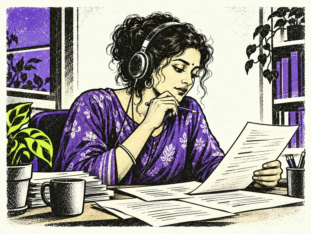
02 / Supporting vignettes

Bold ink shapes, irregular cut edges, directional hatching and stipple. Texture describes the form; it is not a grain filter over the whole page.
Paper and ink do most of the work. Purple is the spot colour. A small lime detail is optional in larger scenes; supporting drawings usually need ink and purple only. Preserve approved art.
Listening, language, preparation, direction and delivery. Natural adult proportions, believable hands and ordinary working objects. Change the subject, crop and gesture from one drawing to the next.
Keep a strong silhouette and unprinted space. Place art directly on paper, without another coloured tile. Use simple SVGs for interface icons; detailed drawings explain the story.
Use this as a starting brief. Supply a new subject and the intended size; keep campaign compositions, logos and lettering out of new artwork.
Draw [subject / useful action] for [placement and size] in Dubskool’s editorial linocut and screen-print style. Use confident near-black shapes, hand-cut edges, directional cross-hatching, stipple and worn ink on off-white paper. Keep adult proportions and a readable silhouette. Add restrained purple spot ink; [omit lime / allow one small lime detail]. Leave breathing room. For a vignette, use a transparent background. No embedded copy, logos, gradients, 3D, blob people, stickers, confetti or decorative sound bars.
Use texture within forms, intentional contrast and grounded gestures. Avoid glossy rendering, generic stock cartoons, busy collages and repeating a microphone in every subject. Keep identity marks and the sculpted wordmark as their original vectors.
Review the actual display size: vignettes at 160–240px, scenes at 320px and above. Remove detail that disappears. Keep generated masters, provenance and colour intact; export raster artwork at least 2× its intended display size. Preserve transparent alpha, aspect ratio and meaningful margins. Keep text as HTML.
Describe meaningful scenes; use empty alternative text when adjacent copy already explains the image. Drawings never stand in for evidence of client work or real sessions. Keep supporting art still. The hero hands act only as the visitor scrolls, as defined under Motion. If a journey moves, retain reading order, keyboard controls and a static reduced-motion layout.
The new scene is AI-generated brand artwork. It depicts a fictional editorial moment, not a client or actual session. The homepage process and artist journey demonstrate supporting illustrations in context.
The studio film is supporting proof, opened by a button beneath the illustrated hero. Keep a 9:16 frame with user-initiated playback; copy length never stretches it. The real founder photo and recording remain biographical evidence.
Founder portrait in grayscale; studio film and approved imagery may retain colour. Do not invent a blanket grayscale treatment.
No autoplay audio. One sample at a time. Use an avatar to play or pause audio, without a timeline, duration or progress ring. Keep sample context and transcripts nearby. Video may retain its playback controls.
No voice identities, provider IDs, private selection notes, PAN or bank details. Publish partner logos only with permission.
08 / Space & surfaces
Use typography and alignment before another coloured panel. Let related elements sit together; let different sections breathe.
1192 px website canvas. 32 px desktop gutters; 22 px phone gutters. Reading copy usually stays within 65–75 characters. This manual adds a desktop contents rail.
When edges sit close, outer radius = inner radius + padding. Here: 24 = 10 + 14. With generous padding, the shared control radius can stand on its own.
Use subtle layered shadows for a raised surface. Form fields still need a visible boundary. Images use a 1 px, 10% pure-black inset outline on light backgrounds.
A dark section, with restraint
Our direction.
Story, audience and deadline.
Voice, language and production.
People check the details.
Reviewed files for the next step.
Calculator invitations stay paper and ink. Lime may mark the key phrase; no lavender panel or decorative handwritten second line. Leave 64–96 px between major stories, or 44–56 px on phones.
Use the campaign’s confidence, not its exact layout everywhere. A single useful scene explains more than a paragraph of decoration. Voice and language deserve equal weight across the site.
One short H1, 25–50 words, one main action and a clear illustration. Keep the primary action before the image on phones.
One idea per chapter. A useful image, a short heading and 15–35 words. Longer detail belongs after the story, under a clear heading.
The task gets the space. A small supporting scene and enough context to make the next choice. Never squeeze controls to fit artwork.
Readable text and navigation lead. Small art can orient a library; dictionary definitions, consent and terms stay complete and searchable.
Six project buttons, one illustrated preview and a short set of relevant service chips. Keep keyboard tabs, one clear next step and full readable fallback content. See the chooser.
Stack the same content; do not force desktop percentages into a narrow row. Use 22 px gutters, readable 15–17 px body text and 44 px targets. Keep a peek of the next journey card where useful.
Hero scenes at 360–600 px; supporting vignettes at 160–300 px. Preserve the silhouette and alpha. No stock portrait in an illustrated hero; retain real founder imagery only where the person is the subject.
Start with a human headline, one useful explanation and a next step. No filler paragraphs to balance a grid. Never cut rights, earnings, privacy, pricing qualifications or factual source text to hit a word target.
09 / Motion
Movement should explain a response or make an invitation easier to use. Keep it interruptible, predictable and optional.
A 12 px lift / 320 ms / no bounce.
160–200 ms for controls. Specific properties only, never transition: all. Use .96 on press. Keep exits softer than entrances.
Journeys keep native scrolling and visible step controls. Client journeys keep a native vertical story and a sticky illustration. The campaign eases into and out of its pinned chapters; keep its entry and exit holds.
Reduced motion keeps a static, complete reading order. Artwork can settle once by 10 px over 560 ms; text and controls never wait behind a reveal. No autoplay audio or decorative loops. Texture avatars are a contained exception: quiet idle motion, a pause control and a still reduced-motion fallback.
No thin decorative rules, sound bars, bouncing logos, rotating stars or sticker effects in the artist strip. The local lift demo is intentionally opt-in; it does not replace the live banner controller.
| Moment | Behaviour | Fallback |
|---|---|---|
| Controls | 160–200 ms. Specific colour/border/transform properties; .96 press. Inset dropdown chevrons by 16 px. | Visible focus; no required hover. |
| Artwork entering | Supporting illustrations stay still. Keep artwork and copy visible on entry; no repeated rise or fade. | Static if reduced motion, no animation API or a modal is open. |
| Hero/project scene | The hero’s separate hands make a short writing stroke and a 2.4° wrist cue. Other scenes stay intact: scroll draws a small contextual ink mark. No masked-out anatomy or patched paper. | Static for reduced motion. No animation is required to understand the page. Never slide an entire scene to imply a hand action. |
| Client journey | A native vertical story. An intact illustration stays alongside the readable steps on desktop; Previous/Next scroll to real chapters. No wheel interception. | All four chapters remain in the reading order. |
| Artist journey | Every chapter has distinct artwork; the hero is not repeated. The introduction is part of the pinned stage. Smoothstep progress and a 12% viewport entry/exit hold; buttons use inverse easing. | Stack chapters if reduced motion or the stage cannot fit. |
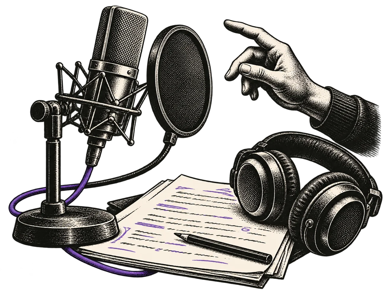
| Royalties | Five viewport lengths: hold the mic, raise it, wait, then falling notes. Keep the cable and notes contained within this section. Highlight runs from 0% to 100%. | The complete original illustration and full highlight. Never an empty block. |
Illustration & scroll
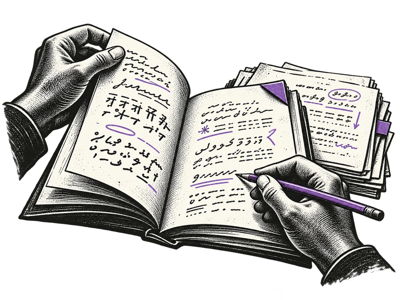
The engraving stays whole. Scroll draws one small ink mark; reverse to retrace it. Only the hero uses genuinely separate hand layers.

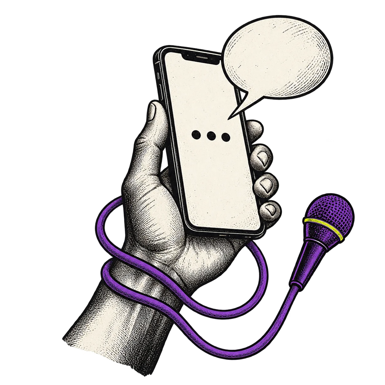

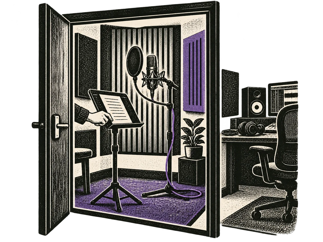

Usage-based royalties
Mic ready. No money visible.
This local scrubber uses the production royaltyFrame() model. It sends nothing. The live sequence remains scroll driven; no timer, hover reset or endless automatic animation.
10 / Words & trust
Warm, direct and capable. Say what happens, what someone needs to do and what remains a choice.
Send us your brief.
Unlock limitless audio possibilities.
Your voice belongs to you. So does the choice to record for AI.
A guaranteed new income stream.
We couldn’t send this. Your text is still here.
Something went wrong.
Use “a global audience”, not a provider name or count. The campaign headline is “Your voice at work.” Keep ownership and consent explicit. “Earn when your voice is used. Usage varies; income is never guaranteed.” Use “pen-name” consistently.
Do not invent testimonials, client cases, bookings or referral rewards. Label generated demonstrations. Private feedback stays private; public permission applies only to the separate review, display name and company.
11 / In use
Composition studies using existing artwork and real destinations. These examples show hierarchy and colour restraint; they are not replacement pages.
Client / service introductionVoice & language production
A voice for your story. The words for your world.
Send a briefFor artists
An invitation to record your voice and earn usage-based royalty. Earnings depend on use and aren’t guaranteed.
Apply as an artist
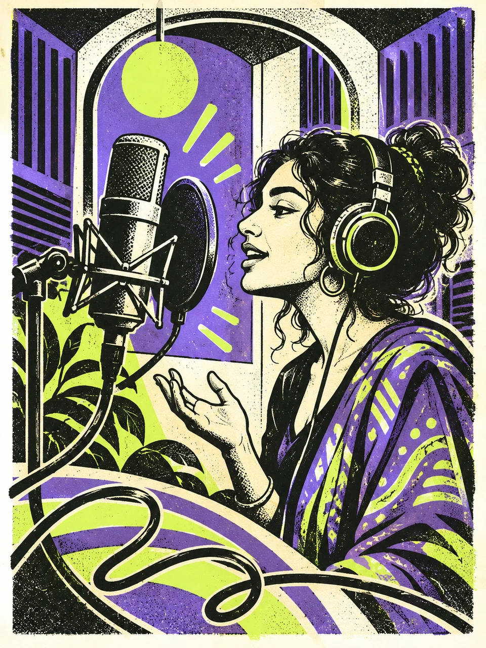
Both begin on paper. The illustration carries purple; a short phrase carries lime. The original campaign mark sits on a small paper tab; no additional material colour is needed. Ink sections remain useful for compact artist invitations and calculator results, not every other story.
12 / Interaction patterns
Four compact examples for finding, choosing and finishing. Paper and ink lead; purple marks an active choice. These demos stay local.
A clear result, a useful empty state and a quiet loading state.
Local demo · loading is simulated
2 results
No matching pages.
Try a broader phrase, or clear your search.Use the navbar menu surface and rows. Language flags sit in a 1:1 circle. Keep the chevron inset, with Arrow keys, Enter and Escape.
Example sample library · no voice identities
No samples match both filters.
Remove a filter to see more.Keep progress visible and drafts intact through validation and retry.
Local demo · nothing is sent or saved
Nothing was sent or saved. A real form shows success only after the server confirms it.
Keep the purple focus ring inside fields. Country and language selectors use this same control. OTP lives in a separate native modal; verifying a number does not grant marketing permission. Required contact permission and optional updates are separate, unchecked choices. Terms and Privacy open in the same paper modal with Escape and focus return.
A compact disclosure and a focused mobile drawer.
Navigation example · links open existing pages
Services opens the dropdown. The menu button opens the mobile drawer. Escape closes either and returns focus.
Examples show behaviour, not a new integration. Search queries and form entries are not logged, sent or stored. The production site retains its current controllers.
13 / Build & verify
Use the existing source, controllers and shared rules. This manual consolidates the identity; it does not create a second design system.
dist/brand-system.css owns colour, fonts, spacing and radii. The kit reads those tokens directly. Supporting tokens remain available; their existence is not a reason to use them all.
dist/public-ui.css loads last on marketing and Resources. The illustrated renderers in scripts/ own the primary page layouts. Keep family rules in the shared files; do not create a second marketing-only palette.
dist/illustrated-common.js and dist/brand-motion.js own shared page behaviour and purposeful scroll accents. The existing search, modal and form controllers remain authoritative. Keep the existing menu, modal, playback and intake controllers. Use the shared picker for every language choice, including media. Align consent checkboxes in an explicit 18px column. Audio examples and public samples share dist/audio-avatar.js and dist/audio-avatar.css. Compact play/pause icons stay visible on touch and at rest; avatar motion starts with playback. Keep transcripts and provenance beside the sample. Video controls remain available. The kit and campaign use the same select-menu.js and select-menu.css picker. The kit’s form examples never call the intake API.
Preserve stable anchors, dictionary IDs/aliases/files and private voice provenance. Resources is part of the same brand. Never regenerate the dictionary as a styling step.
Project switching: one frame sized to the tallest preview, a quiet 220–320 ms crossfade, and no restart when the same choice is clicked. Inactive panels are unavailable to keyboard and screen readers. Client journeys use a sticky illustration beside a native vertical story; reduced motion and short screens show every chapter in reading order.
Selected Mobbin references inform the manual’s structure: a persistent contents rail, a large asset specimen and a clear type hierarchy. Dubskool’s supplied marks, fonts and colours govern the result.
Brand kit 1.9. Dubskool’s visual and verbal reference. Interactive form examples run in this browser; fields are not saved, logged or sent.